Capium
Your AI Wealth Manager
What if everyone had someone managing their money?
Wealthy people don't manage their own money.
"Wealthy people don't manage their own money. Someone does it for them. That realization came out loud one day, and from it I could see the entire product: an AI advisor that does for everyone what wealth managers do for the few."
73% of Americans have no financial advisor. Not because they don't need one, because access requires $100K+ in investable assets and $1,000+/year in fees. Everyone else gets a budgeting app that requires 60 minutes of setup and loses 95% of users within 30 days.
Capium isn't a budgeting app with AI features. It's an AI advisor with budgeting capabilities. The distinction is the entire point.
A market nobody has touched.
Nine screens. Each with a deliberate job.
A complete iOS experience, from first launch through the ongoing advisor relationship.
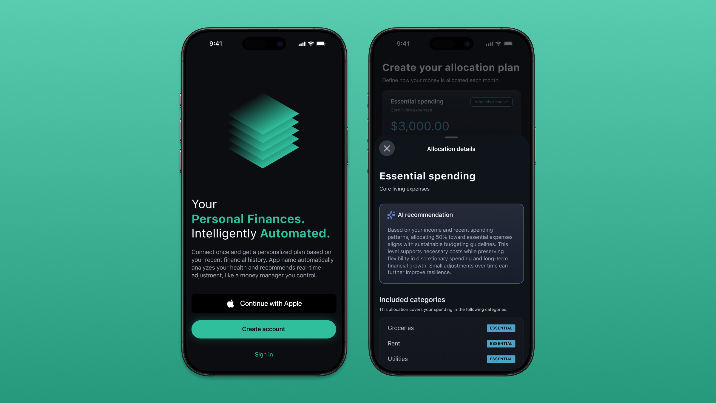
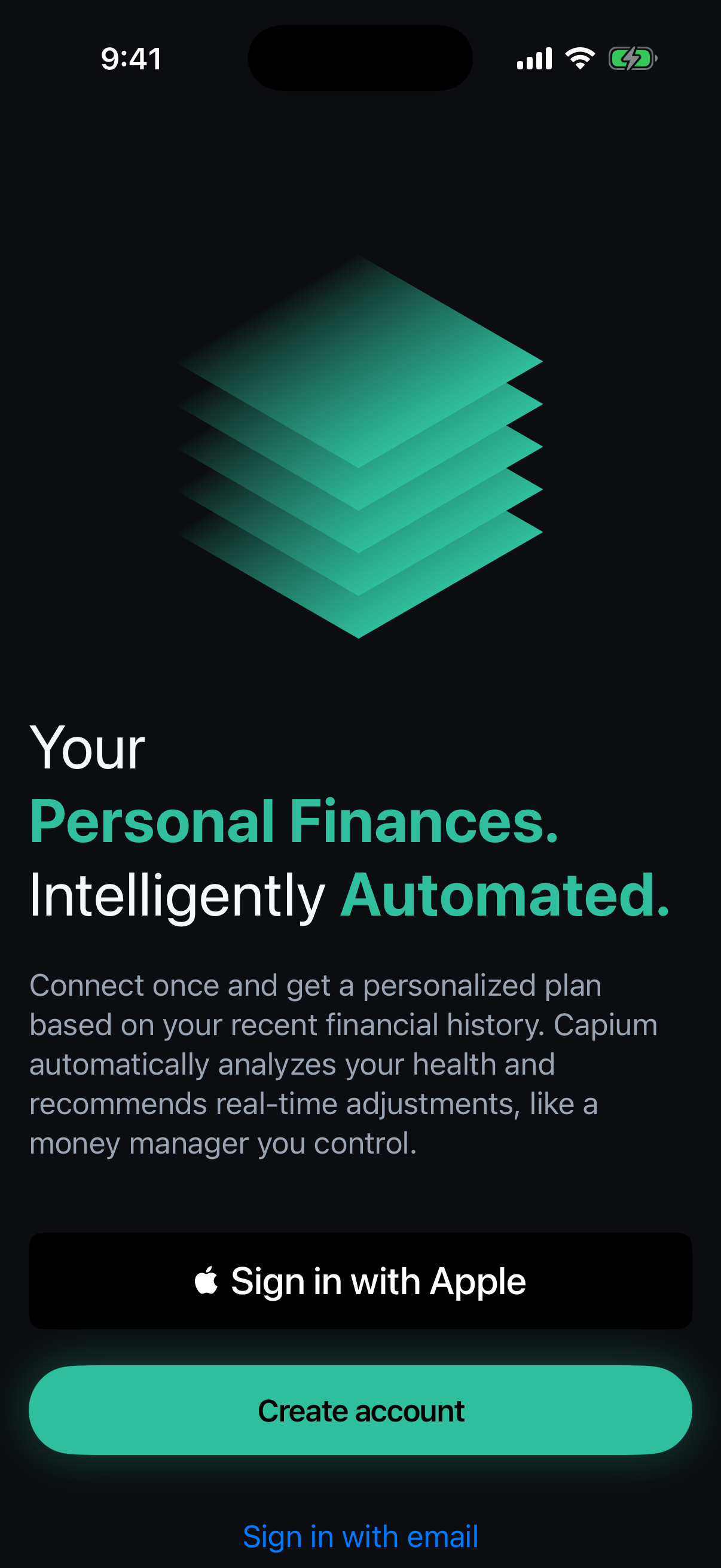
Welcome
"Your Personal Finances. Intelligently Automated." The word Your comes first. "Like a money manager you control" is the entire philosophy in six words.
Account Connection
Plaid integration. One action. The friction of traditional apps lives here; this screen eliminates it.
Confirmation
User sees what's connected, can adjust. Then a CTA: Analyze Transactions. The user initiates the analysis. Consent built into the moment before truth arrives.
Loading State
Most apps treat loading as dead time. I turned it into witnessed work. "Analyzing transactions... getting account balances..." The user sees effort applied to their specific situation before any result appears.
Analysis Complete
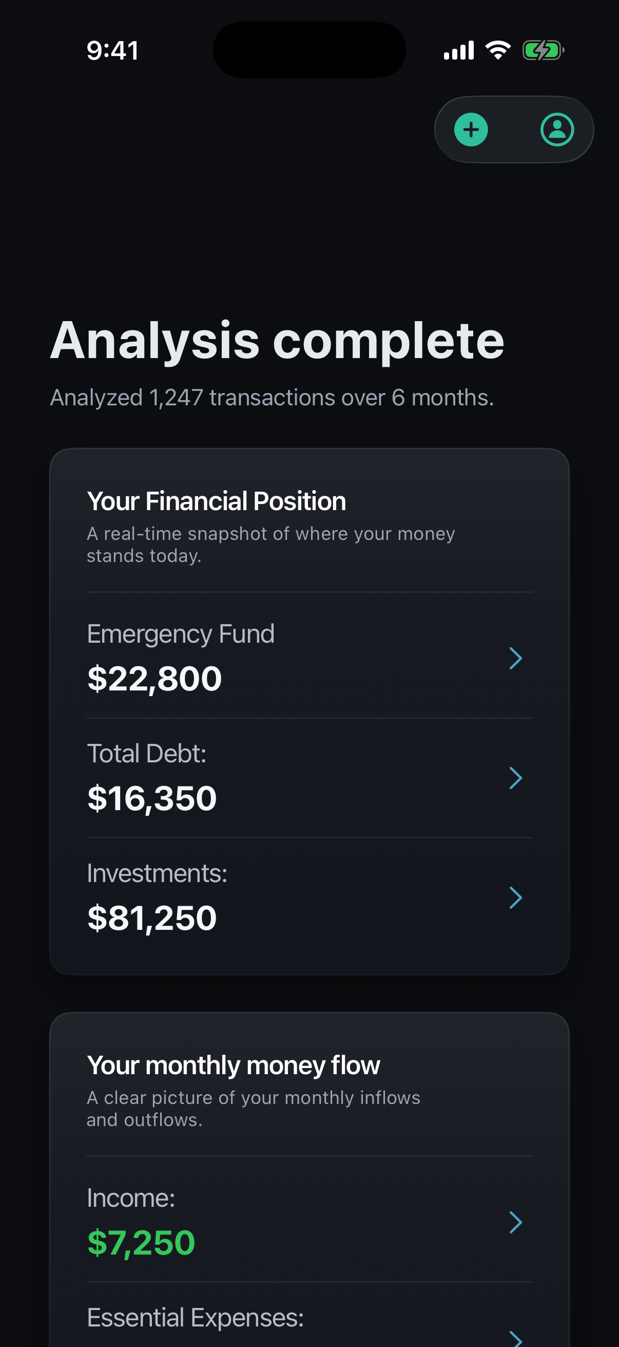
The truth-telling moment. Your Financial Position appears first: truth before action. Large, confident numbers. The word today signals this is alive, not static. No gamification, no anxiety-inducing alerts, no comparison to other users.
Verification
The app shows its work. Every number is traceable to transactions. Low-confidence categorizations are flagged for user review. The app admits what it doesn't know. By the time someone has reviewed their data, they've participated in the analysis. Truth becomes collaborative.
Build Your Plan
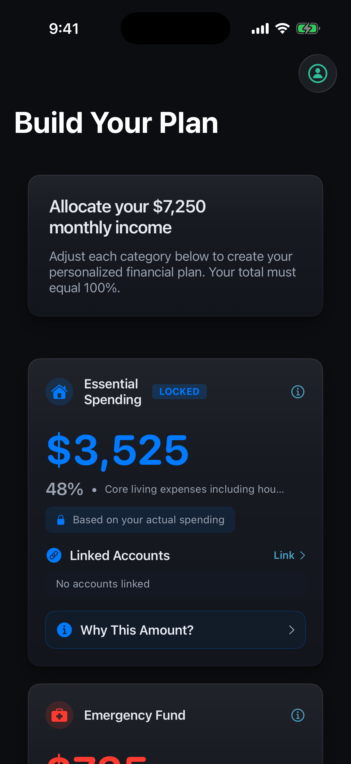
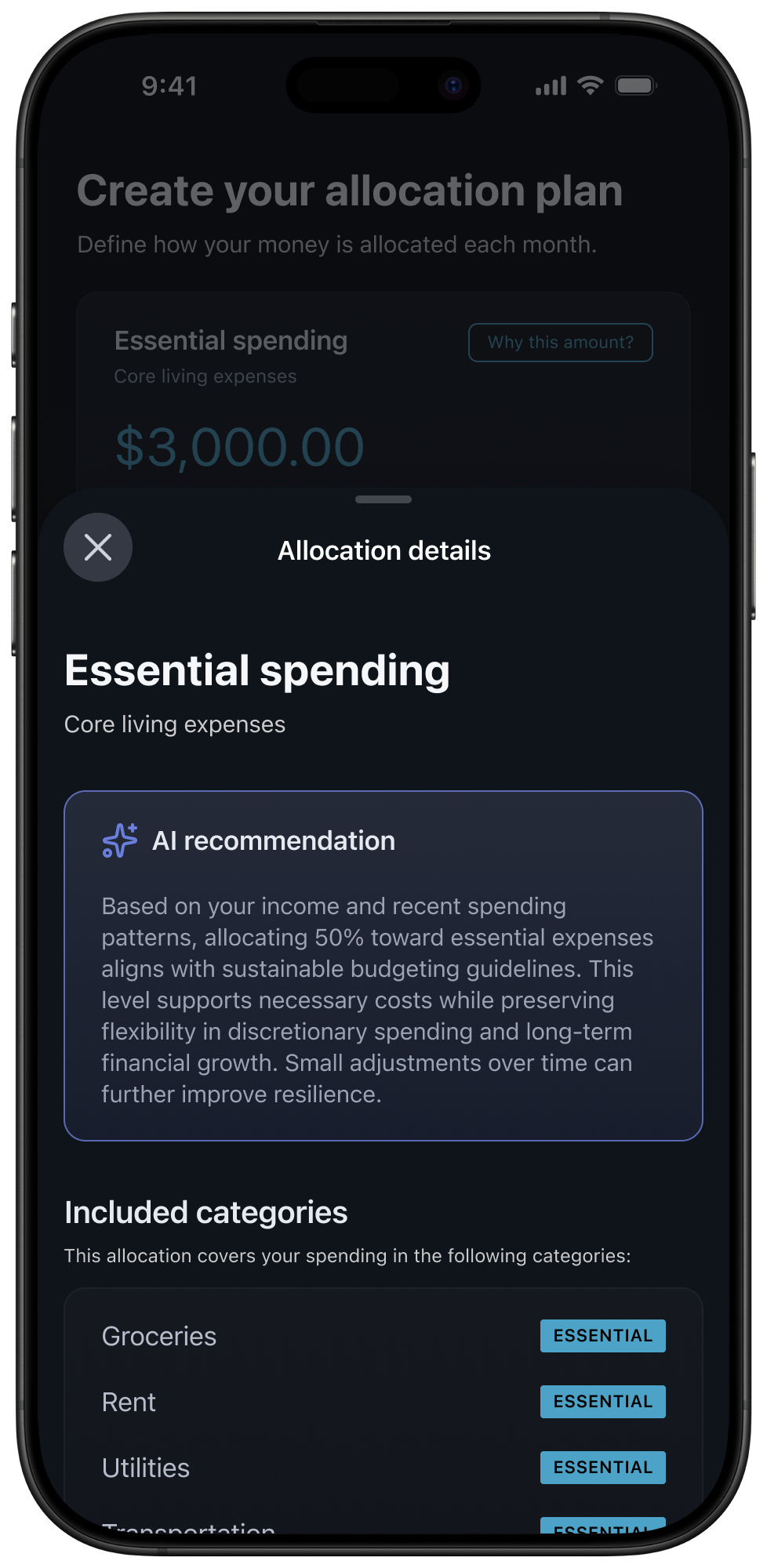
Fiduciary-grade recommendations with agency. Essential Spending is locked; the app won't let you lie to yourself about fixed costs. Discretionary offers ranges: Low / Recommended / High. "Why This Amount?" appears on every number.
Create My Financial Plan
The user creates their plan, not the app's plan. Language preserves ownership.
Why This Amount?
Every number can be interrogated. The sheet explains the reasoning behind the allocation and lists exactly which spending categories it covers. An AI recommendation that can't show its work is just a number with confidence.
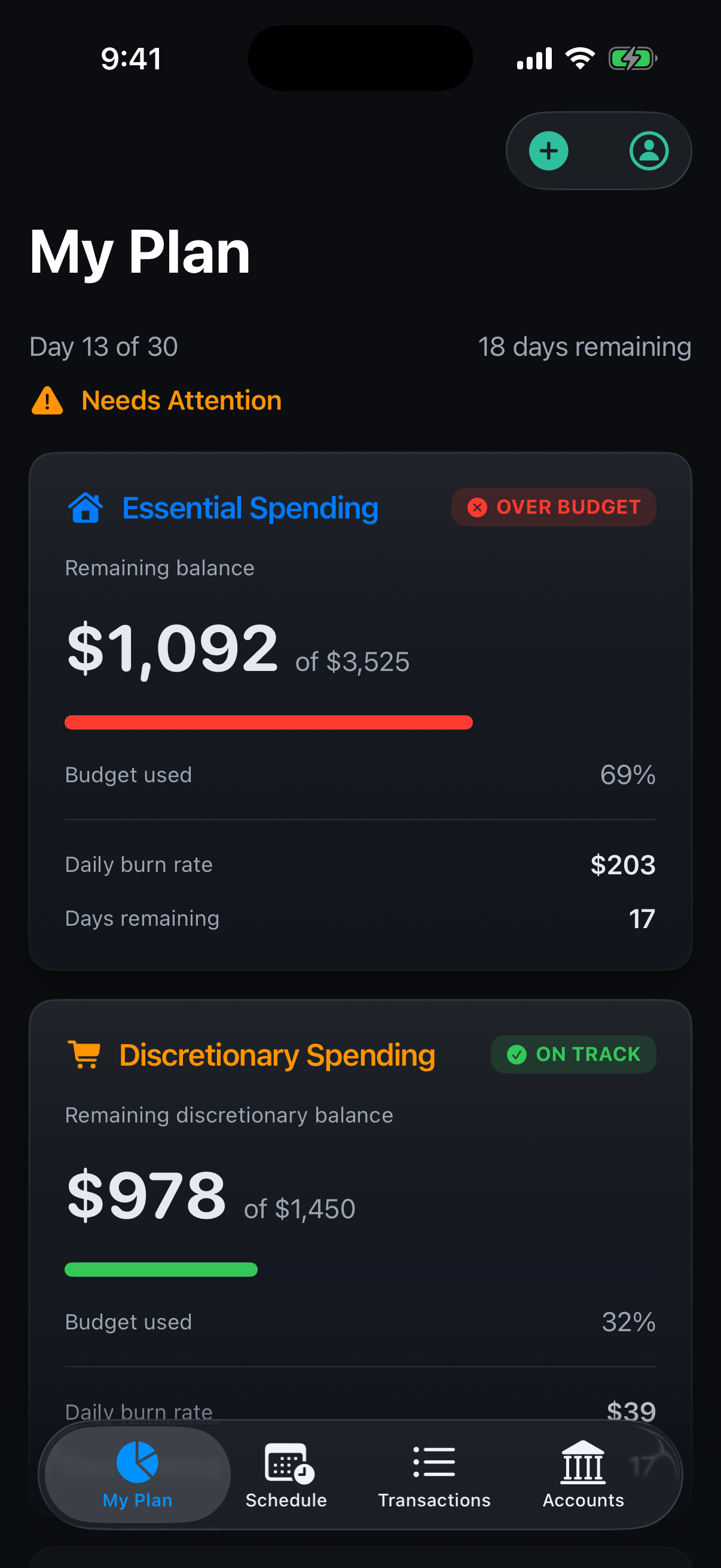
My Plan
The living relationship. Current spend vs monthly target. Daily burn rate. Days remaining in cycle. Month-over-month comparison. Months of coverage: transforms $X in savings into felt security. Just like a real money manager you control.
Before and after.
A background hum of "I should really figure this out." Accounts scattered. Spending unexamined. Vague anxiety that never resolves.
Confident, with a sense of relief. Not because the situation magically changed, because the ambiguity is gone. Someone looked clearly and told you where you stand. The cognitive burden transferred to something you trust.
This is the emotional outcome the product is designed toward. Every screen decision points here.
The decisions behind the product.
The loading state is a feature, not dead time. 10–15 seconds of witnessed analysis creates the felt sense that real work is being done on your specific situation. Speed would have undermined trust.
Truth before action. Financial Position appears before any recommendations. Most financial apps lead with what you should do. Capium leads with what's true. Sequence is philosophy.
The app admits uncertainty. Low-confidence transaction categorizations are flagged and handed back to the user. This is the opposite of black-box AI, mirroring a good advisor who says "does this look right to you?"
Essential Spending is locked. The plan won't let users undercount fixed costs. Most budgeting apps let you lie to yourself. This one holds you to reality.
Months of coverage, not dollar amount. $8,400 in savings is abstract. Seven months of safety is felt. The same number, reframed by the system, lands completely differently.
Zero setup friction. Under 90 seconds from launch to personalized plan. The 95% drop-off rate on existing apps lives in onboarding. This was the constraint the entire experience was designed against.
A working iOS application.
Capium is a working iOS application, not a prototype. The GitHub repository contains a production-structure SwiftUI app with Plaid integration, a Node.js backend handling secure token exchange, transaction analysis across 6 months of data, AI-powered proactive guidance, and automated budget generation from spending patterns.
The design is built to the same standard it's designed to, not as a portfolio artifact, but as a real product.
Want to talk about this kind of work?
Whether it's a role or a project, the conversation starts the same way.