Project Summary
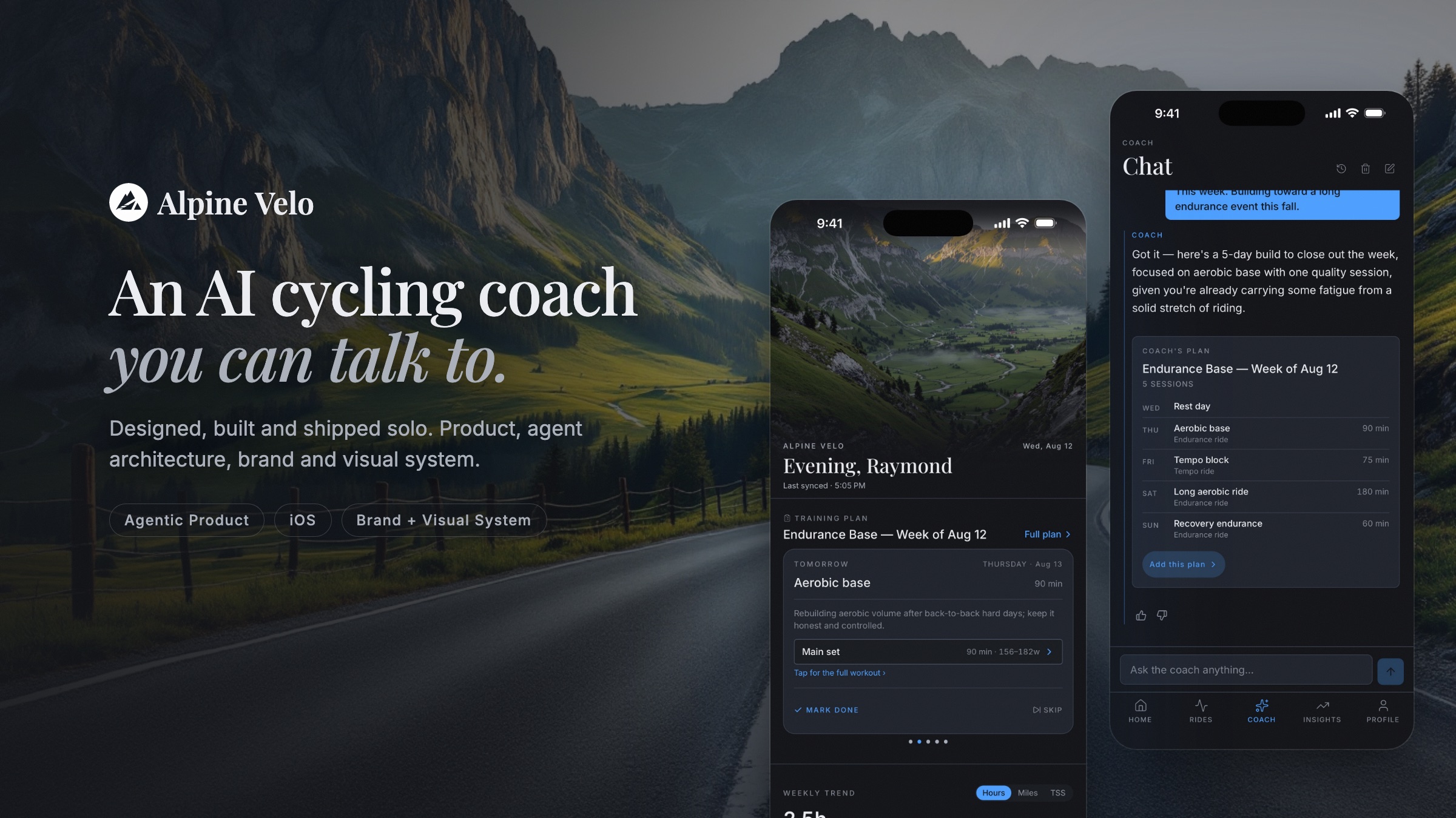
Alpine Velo is an AI cycling coach you can talk to. It reads every ride, builds a training plan that adapts to the riding you actually do, and explains its reasoning in plain language. I designed and built the whole thing on my own and shipped it to the App Store: the product, the coaching agent behind it, the brand, and the visual system.
 For iPhone
Discovery
What I learned about riders, their tools, and the opportunity space.
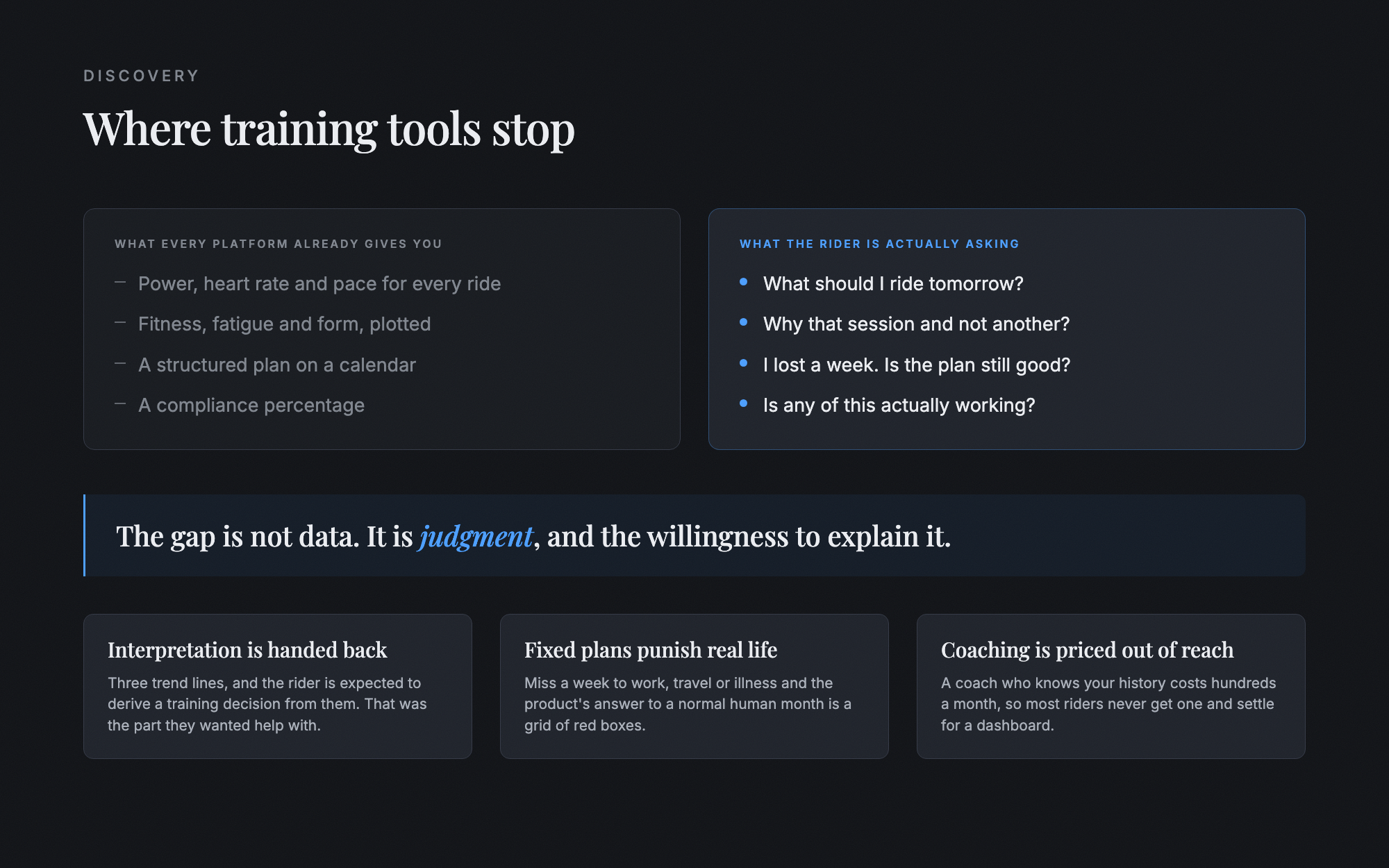
Training apps measure riders. They don't coach them.
Every platform a rider already uses will happily show them a number. None of them will answer the only question that actually matters, which is what to do tomorrow and why. The gap is not data. The gap is judgment, and the willingness to explain it.
Design Approach
How I turned that gap into a system, and how agents let one person build it.
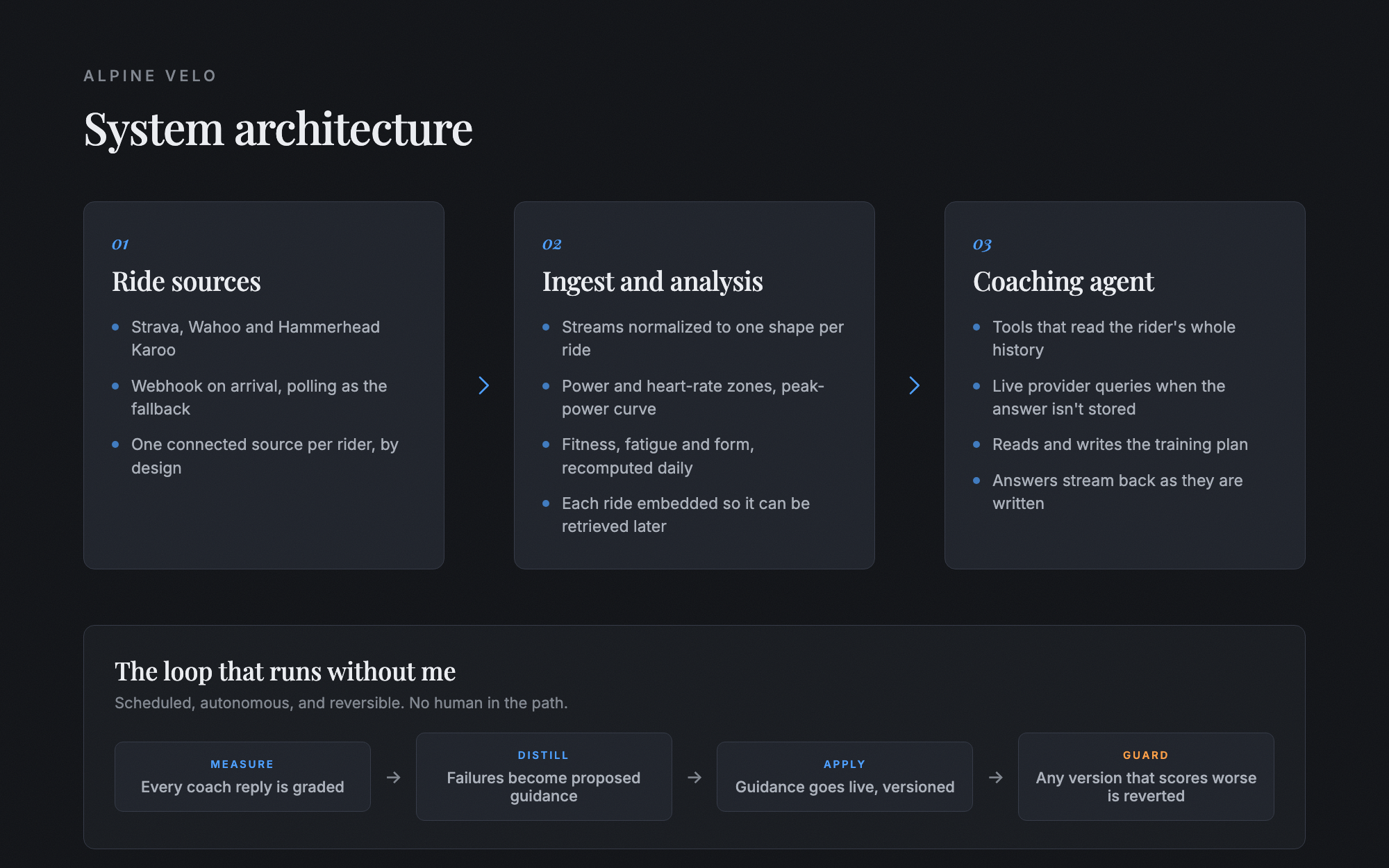
Design the judgment, not just the screens
The hard design problem was not layout. It was deciding what the coach is allowed to say, what it must look up before it answers, and how it behaves when the rider's week falls apart. I designed those rules first and treated the interface as the surface they show through.
What I Delivered
A shipped iOS product, the agent behind it, and the brand it lives in.
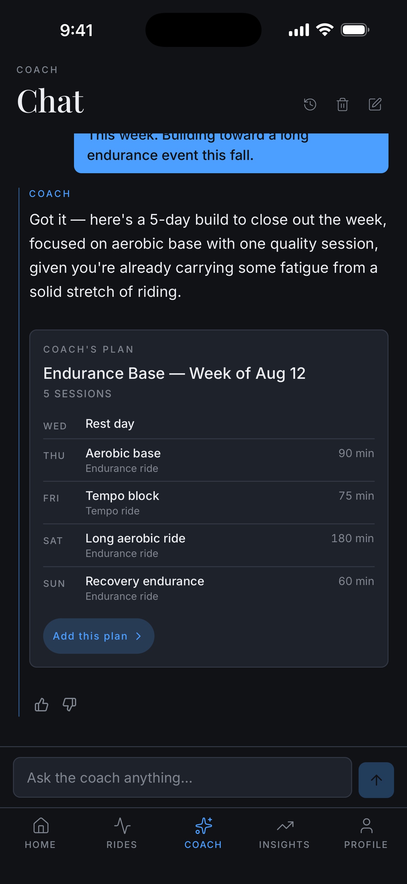
A coach that answers, then acts
The conversation is the product. A rider can ask why today's session is what it is, what a number means, or how to handle a missed week, and the coach answers from their actual history. When the answer is a plan, it builds one inline that the rider can accept in a single tap.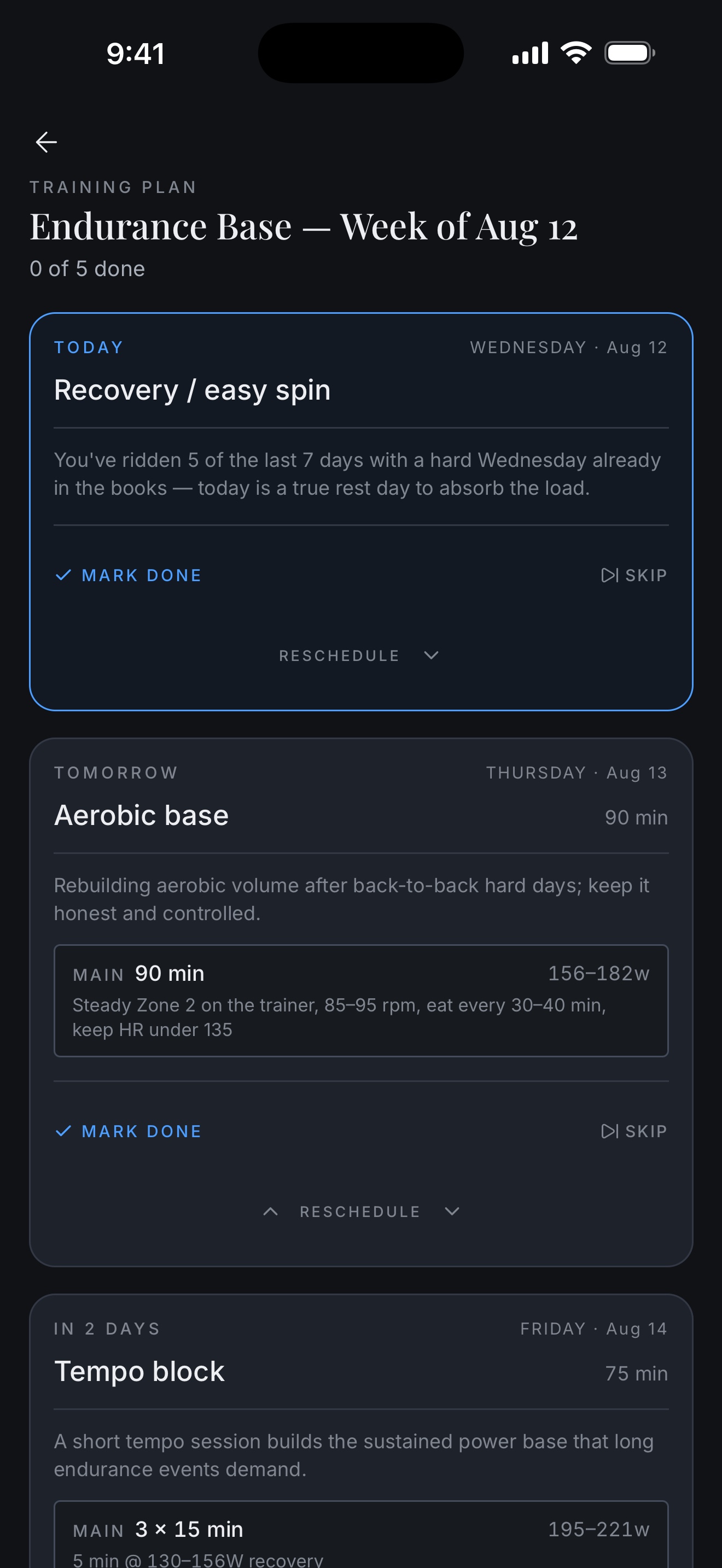
A plan that moves with the rider
Every session carries its prescription and its reason. Miss one and the plan reshapes rather than marking a failure. There is no compliance percentage and no streak anywhere in the product, which was a deliberate product position and not an omission.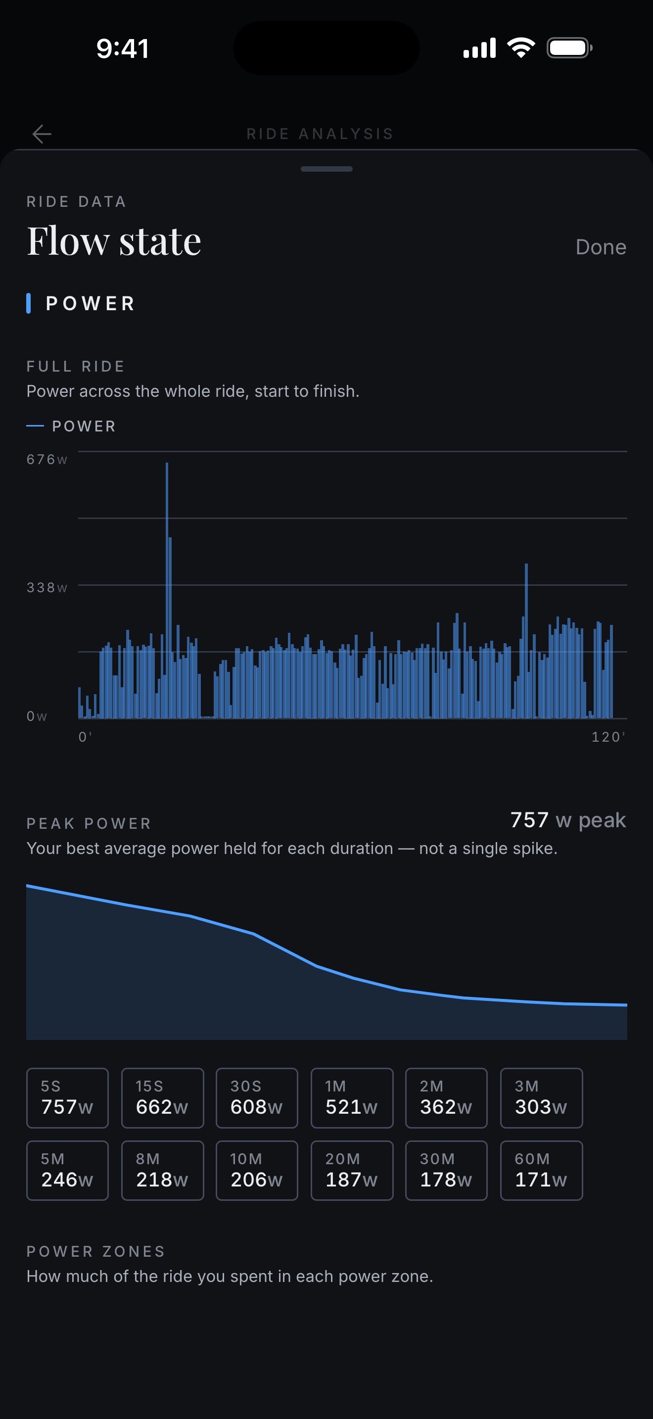
Analysis a rider can interrogate
Zones, peak power curves, cadence and segment efforts are computed the moment a ride lands. Any metric can be tapped for a plain-language read of what it means for this rider, which turns a chart from a scoreboard into something they can reason with.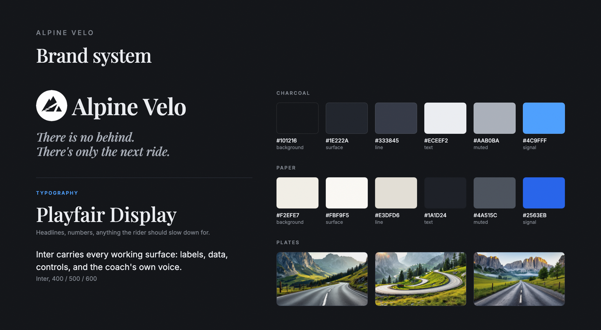
A brand system, not a coat of paint
Name, mark, palette, typography and the photographic language, built as semantic tokens in a dual theme so nothing is a hardcoded colour. The same tokens drive the app, the App Store frames and the marketing site, which is why the three read as one product instead of three projects.Key Decisions
These are the decisions I made that shaped the product's experience.
No streaks, no compliance score
Every competitor uses adherence pressure to drive retention. I removed the entire mechanic and replaced it with a plan that reshapes around what actually happened.
Make the coach look things up before it answers
Rather than pushing a summary of the rider into the prompt, the coach is given tools and is required to fetch. If the data is not there, it has to say so.
Let the coach improve itself, inside a guard rail
Coach replies are graded automatically. The failures are distilled into proposed guidance, the guidance goes live on its own, and any version that scores worse is reverted without me.
Interested in working together?
Let's talk about how I can help solve complex product challenges for your business.