AI Finance Dashboard
A production-ready UI for AI finance agents. Concept to deployed product in a single build loop: Figma → v0 → Claude Code → Vercel.
What this is and why it exists
Most AI agent demos show capability without context — a terminal output, a JSON blob, a screenshot of an API call. What they don't show is what the agent experience actually feels like to someone using it.
I built this to answer a specific question: what would it take to give an AI agent startup a production-ready UI out of the box? Something their finance agents could plug into and actually demo to customers. Not a mockup. Not a prototype. A live, deployed product with real data, real interactions, and a full design system.
The insight
The bottleneck in agentic product development isn't the agents. It's the interface layer. Most teams ship great plumbing and terrible doors.
This dashboard is an argument in code: what the review surface for a finance agent fleet should actually feel like. Designed for the human monitoring the agents, not just the agents themselves.
The Build Loop
Each tool played a specific role. The order mattered.
Figma
Concept, IA, visual design system
v0
Scaffold React components from design intent
Claude Code
Review logic, refine interactions, debug edge cases
Vercel
Deploy and share with persistent URL
What I learned
The Figma phase wasn't just visual design — it was specification. Every decision made there paid off downstream. When the intent was clear, the AI tools accelerated it. When it wasn't, they amplified the ambiguity.
The bottleneck isn't the tools. It's knowing what to design before you start generating.
9 pages. All functional.
Every page has something real to explore. Structured so a prospect could navigate it independently.
Dashboard
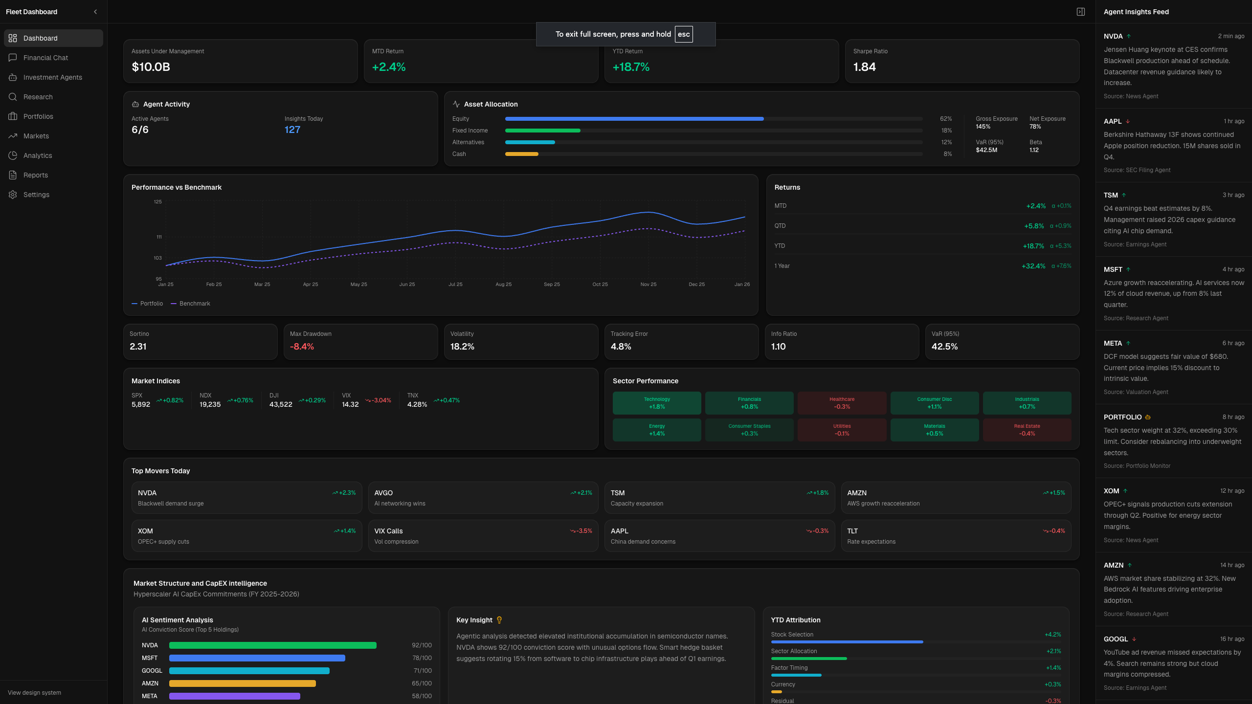
01Primary landing — agent activity at a glance
Agent status, AUM, MTD/YTD returns, live insights feed, portfolio chart
Financial Chat
02Conversational interface for agent queries
Chat UI with agent context, streaming response pattern
Investment Agents
03Agent management and configuration surface
Agent cards, active/inactive states, settings access
Research
04Deep-dive market and company research
Structured report layout, source attribution, agent metadata
Portfolios
05Portfolio-level view across holdings
Holdings table, allocation breakdown, performance delta
Markets
06Real-time market overview
Index cards, sector performance heatmap, movers list
Analytics
07Performance attribution and risk metrics
Sortino, Sharpe, drawdown, tracking error panels
Reports
08Downloadable and generated report outputs
Report list, generation states, format options
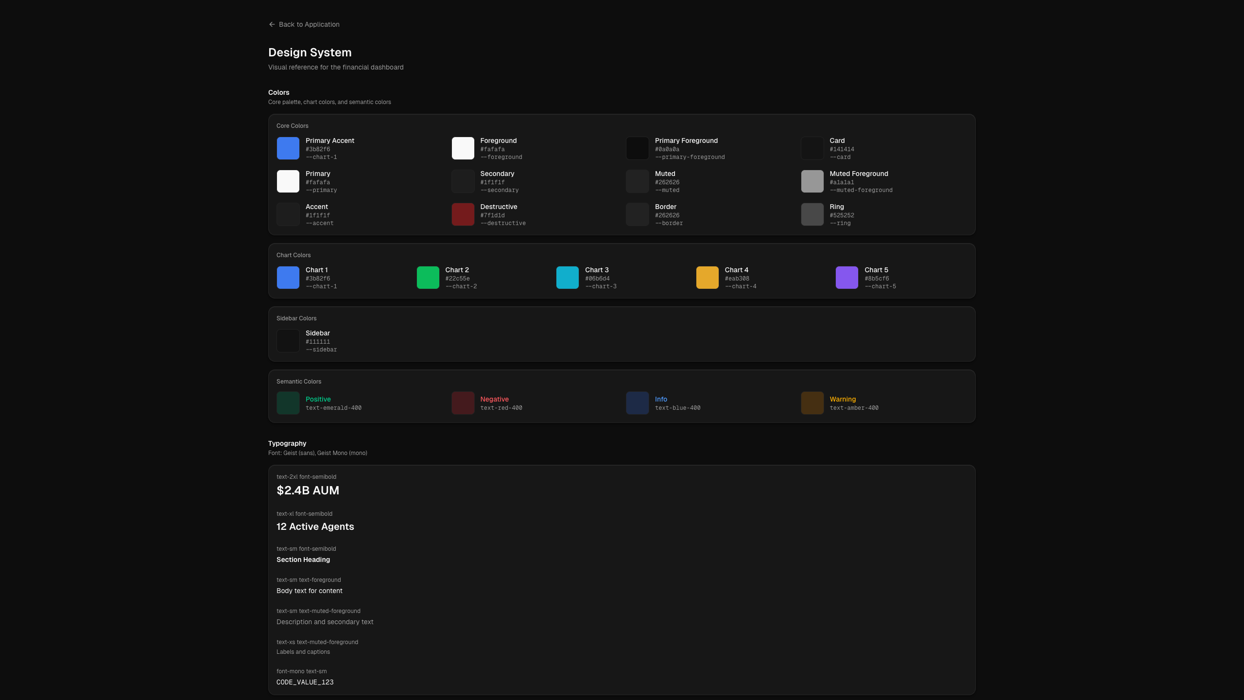
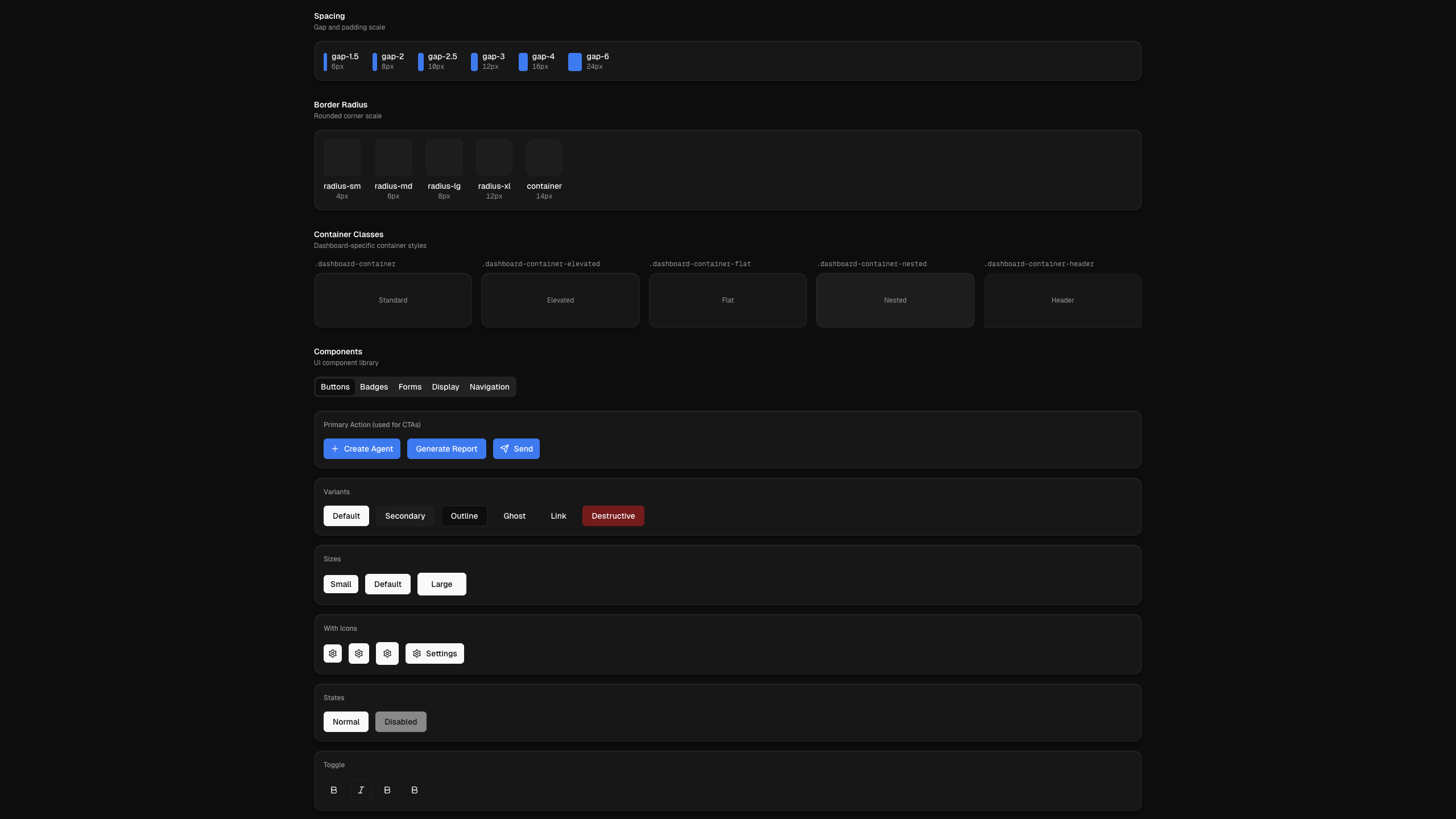
Design System
09Internal documentation for dev handoff
Color tokens, typography scale, semantic color roles
Key Design Decisions
Each decision has a claim, a reason, and a consequence.
Dark theme as the default
Finance professionals spend hours in terminals and data-dense environments. A dark theme isn't aesthetic preference — it reduces eye strain in extended use and creates the visual density that signals 'serious tool.'
Agent Insights Feed as a first-class surface
The feed on the right panel isn't decoration — it's the primary argument for why an agentic UI is different from a traditional finance dashboard. Each item is timestamped, source-attributed, and action-relevant.
Information density over 'clean'
Finance dashboards that hide complexity to feel clean are doing a disservice to their users. The design task was to manage density through hierarchy — not to reduce it.
Realistic data throughout
Every metric, every ticker, every agent output is realistic. Not random, not obviously fake. A prospect navigating this demo should feel like they're looking at a real product.
See it for yourself
The demo is live, public, and fully interactive. No auth required.
Want to talk about building something like this?